
SF Ambassadors Case Study
Overview
The San Francisco Community Ambassador program began as a response to rising racial tensions in the city. The program’s outreach has continually evolved and expanded since it inception in 2010. Community ambassadors are the bridge between the individuals of San Francisco and its services. This ranges checking in on the homeless to giving directions or safety escorts to tourists. While working hard to improved the lives of those in the city, ambassadors need to record every single interaction they encounter. Our design team worked directly with the city to enhance the mobile experience and data collection of these invaluable ambassadors.
Design Team: Ryan Han, Omar Alamrani, Joan Tionko
Duration: 3 Weeks
Methods: Contextual Inquiry, Information Architecture, Wireframing, Prototyping, User Interviews, Heuristic Evaluation, Usability Testing
Opportunity
The community ambassadors are currently recording their interactions through Google Forms. The form is long and convoluted, the byproduct of needing to consider different neighborhoods and all potential interaction types. We wanted to understand what the ambassador’s daily experience was like, and which points of their mobile experience affected them the most.
Our Approach
Because we wanted to understand the ambassadors’ daily experience, we shadowed a few ambassador teams for part of a week. We really got a feel of what they provide for the community, and we were able to get a few key insights through observation. The ambassadors were often stopping mid engagement to write down key points on notepads and using their breaks to input the information into the official form.
We conducted a few interviews with different members of the program and found another key insight. In addition to the main users (ambassadors), our research uncovered two more user groups we needed to consider as well. The ambassador team leads and the program’s internal managers had their own needs as well.

Problem
One thing we immediately noticed was that the tasks flows were extremely long. There were 10 required pages to go through before submitting the interaction. The most commonly recorded interactions only used 3-4 of those pages. According to our research, recording tasks could take up to 5 minutes each. Each ambassador needs to record 15 interactions a day. That’s 75 minutes a day spent recording their interactions.
We also found that the ambassadors were scrolling A LOT. In addition to having many pages to get through, many of these pages had a lot of information on them, leading to excessive scrolling to get through the form.
On the data side of things, these hastily recorded interactions were often incorrect or incomplete, leading to poor quality data. The team leads need this data to track their teams and keep them accountable, while the management need this data to show the impact their program is making.
The painstaking process of logging interactions directly affected the ambassadors’ ability to make an impact.
Hypothesis
We believe that redesigning a mobile-suited form experience that promotes faster task completion will help Ambassadors feel more comfortable using the form.
Ambassadors will be empowered to record their interactions quickly and accurately in the moment, ultimately resulting in a better in-session experience and improved data.
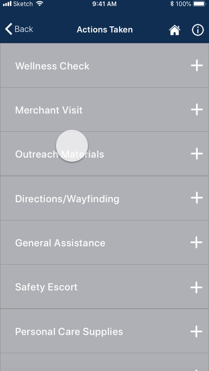
Attacking the Problem

original form
This beast of a form was borne out of necessity from the many different tasks that ambassadors are responsible for. We broke down the form into its smallest pieces and organized the interactions into more simple groups. Next, we used the required components of the most commonly recorded interactions to guide or decisions in making a shorter and more logical flow.
From our research, we found certain categories and pages were not being used. We removed these in our revised form. We then introduced conditional branching to ensure the user only needed to see and input relevant form information. These changes streamlined the workflow, addressing one of the main pain points of the ambassadors.

revised form
A Better Solution
While revising the current form made an immediate impact for the ambassadors, we felt like there was still a better solution out there. The program is an unique and integral part of San Francisco, and it needed a solution to match its impactfulness. We felt the form/database platforms available did not sufficiently cover the needs of the community ambassador program. Our solution to this was to design a mobile application tailored specifically to the program. By doing so, we could more effectively support and empower the ambassadors.

Thank you Klay for being the poster boy of our designs
Design
To create a better mobile experience, we set a few guidelines while we started designing. We used the concept of atomic design to create a more uniform and cohesive application. We made a conscience effort to design for accessibility. Considering that the program is operating under a government agency, we used US government design guidelines to create a more familiar and accessible feel for our ambassadors. Lastly, we wanted to strongly take into account that the ambassadors were issued iPhone 6 pluses for their work. By adhering to these principles, we hoped to create an empowering experience.
Event Flow
One major change we were able to make with the design of a dedicated application was the event flow. Ambassadors are sometimes tasked to provide a safety presence for community events, and the program has more recently evolved to become more involved in these events. For the program’s ambassadors and leaders, we wanted to provide a way for them to more tangibly show the impact their program is making through these events. We decided to provide a session based feature in which the ambassador would be able to log their interactions during these events. We felt this was a great way to show a measurable impact without detracting from the normal logging experience.


Incident Report
Another flow we integrated was the incident report. This flow currently exists as a separate form. Incident reports are required when certain a certain action is taken during an interaction (911/police called). We wanted to make a seamless transition between the main interaction logging flow and the interaction flow, so we came up with the idea of tagging interactions which 911 was selected. These tagged logs would then appear on the incident report flow, to be filled out at a later time.


Interaction Design
Part of creating a good mobile experience is ensuring good interaction design. We made the various on/off states obvious with color and iconography. In addition, we used modal windows for areas needing further input. Ideally, we would’ve liked to further explore interaction animations if we had more time.
Results
During our testing, we were able to validate our hypothesis. We tested the current form alongside the revised form and mobile application. We were able to decrease task completion time by 70%. This video represents the same data output across the platforms (311 flow).
Next Steps
The program was initially formed to provide a safety presence in the midst of rising racial tensions in San Francisco. Nowadays, the ambassadors perform tasks from providing wellness checks to giving tourists directions. The program is always evolving, and our designs would need to evolve with it.
Another step would be to consider the specific needs of the different neighborhood teams. Each area has a different focus, and many of the outreach types are neighborhood based. We would want to do some further research to be able to provide a better experience for the individual teams.

sample screens for wearable functionality
Future Considerations
One unforseen pain point that we discovered during our research was that ambassadors had to log their interactions in a safe area. Because of many of the ambassadors operated in high crime areas/dangerous situations, they often waited to get to safer areas to bring out their phones to record their interactions. There was really no easy solution to this particular issue.
This is where the idea of having our mobile app have wearable functionality came into play. This would eliminate the ambassadors’ need for notepads and logging in large chunks. Although it was a little out of scope, we still felt it was potentially impactful enough for our stakeholders to keep this further consideration in their back pocket.
Reflections
One of the our takeaways from this was that testing early and often was key! This was a great way of making sure our designs still effectively met the needs of our users. By doing so, we were able to facilitate good communication between our client as well (key in any design process!)
By working closely and collaborating with our client, we were able to put together a successful project. We kept our own creativity in check while managing the expectations of the client.